
Earlier this year, I reported on the SARCOF event in Madagascar. For those who don’t live and breathe acronyms, SARCOF—the Southern African Regional Climate Outlook Forum—is a biannual gathering where forecasters from 16 SADC countries come together to create a seasonal forecast for the region. I’ve been involved with the process for a while, so I decided to join this year’s event in Lusaka.
And I wasn’t the only Acacia connection there: Harivao, one of our DGM-funded staff, together with his colleague Fehizoro were generating forecast for Madagascar; Rondro joined the Madagascar team; and Pascal—who’d been at the CCAG Winter School under Acacia funding—represented BNGRC during the users forum.
To be clear, SARCOF isn’t strictly within Acacia’s scope—it focuses on seasonal timescales, whereas Acacia zooms in on sub-seasonal ones. Plus, I wasn’t there solely for Acacia. I was contracted under an extension of the ClimSA project by the SADC Climate Services Centre to redevelop the software that forecasters use to generate seasonal forecasts: the SADC Climate Forecasting Tool (CFT).
Still, it was a perfect opportunity to reconnect with forecasters across the region, especially the Malagasy team, and to see up close how climate information is shared between producers and users—the messy, fascinating “coal face” of climate services.
One of my highlights was watching the Malagasy forecasters pounce on the new version of CFT. Harivao and his colleague Fehizoro, with support from Rondro, quickly realized the tool’s potential: fast statistical forecasts from multiple predictors, one-click data downloads, and robust skill assessments.
Within an hour, Harivao had boxplots comparing over ten predictor combinations, helping them choose the best model for their final forecast.
Of course, it wasn’t all smooth sailing. Stress-testing by actual forecasters unearthed a bug or two, which I promptly squashed. But all’s well that ends well, right?
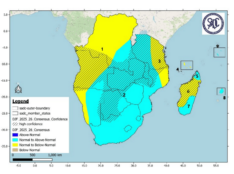
Now, here’s some context. The SARCOF forecast format is… well, let’s call it “unusual.” It divides the region into large zones and uses four categories: below-normal, normal-to-below-normal, normal-to-above-normal and above-normal. Each category is tied to fixed tercile probabilities (e.g., 40/35/25 for below-normal). The point of this form of forecast is – I was told – to always communicate some direction of seasonal anomalies, i.e. even if the expectation is for normal, the two “normal-to..” categories are intended to give the most likely direction of departure from normal. This – I was told – is because decision-makers (and users in general) do not like the forecast for normal because they consider it not to be informative. They also – I was told – do not like a forecast that is climatological, nor do they like a forecast that has no skill. In both these cases – I was told – forecasters hear that they are not doing a good job if they are not able to give an “informative” forecast.
In practice, over 90% of SARCOF forecasts fall into the “normal-to…” categories. That’s because hedging their bets likely helps forecasters avoid scrutiny from superiors if the forecast turns out wrong.
This mindset was clear in Lusaka. We heard comments like: “Don’t talk to me about probabilities—just tell me if it’s going to be wet or dry.”, “For the water sector, a forecast that’s 60% accurate isn’t helpful—we need 90% assurance.” and “Yes, the climate is chaotic, butterfly effect and all, but what are you doing to overcome this?”
This shows how difficult a task the forecasters face. Generating a forecast is one thing; communicating it – is another. They have to always find a balance between scientific defensibility and credibility of information and perhaps unrealistic expectations from the target audience. A balance between the complexity of forecast information and the simplicity of messages that are to be actually communicated. Finding that balance might be easier if you are talking to a journalist or an NGO, but it might be really, really difficult if you are talking to your minister or director, i.e. when power relations kick in.
Even among the forecasters themselves, there’s a divide. Some want a shift toward probabilistic forecasts with articulated skill; others prefer to stick with familiar categories and methods that they find easy to communicate and intuitive.
And honestly? I can see both sides.
The scientist in me says: “Let’s be honest and precise. Show skill metrics. Communicate real probabilities. Stop hedging.”
But my 30 years of working with practitioners in southern Africa whisper a different truth. Most users do not have a good grasp on probabilities. The current categories, weird as they are, make intuitive sense. Change takes time, and it works best when it comes from within.
So ultimately, my advice to the forecasters is – you have to have an honest discussion about this – and it is not just you – that discussion should involve users too, or in fact be centered on them. Where do you all want to go with your forecast? What will it take to build a better understanding of your product amongst users? What will it take to challenge them to engage with your product at a more advanced level? Are you sure you have a good understanding of their needs and the ways they use forecast in their decision-making processes? Is there perhaps a scope for diversifying forecast products to target different users’ needs and abilities to interpret the forecast? What would it take to do so?
For Acacia, SARCOF offers important lessons. We already create spaces for forecaster–user engagement—our Test Beds are a great start—but these SARCOF experiences should remind us how complex this space is. Context, perceptions, skills, power dynamics… None of it is simple.
Still, we’re on the right track. Acknowledging that complexity is part of building trust and making a lasting impact.

Leave a comment